
Print & Packaging
We are experts in creating beautiful and compelling pieces in print.

Digital Magazines
Digital Publishing & PDF Publishing
A regular client magazine is a great way to build brand and to engage an audience. A great example is Covisory Connect, created for the team at Covisory to keep them front of mind in their exclusive professional zone!
This magazine is supplied to us as raw word files and we do the rest to turn basic copy into an interesting and engaging read.
Each year the covers are themed and the year planned out in advance, so the design constantly evolves to add further interest.
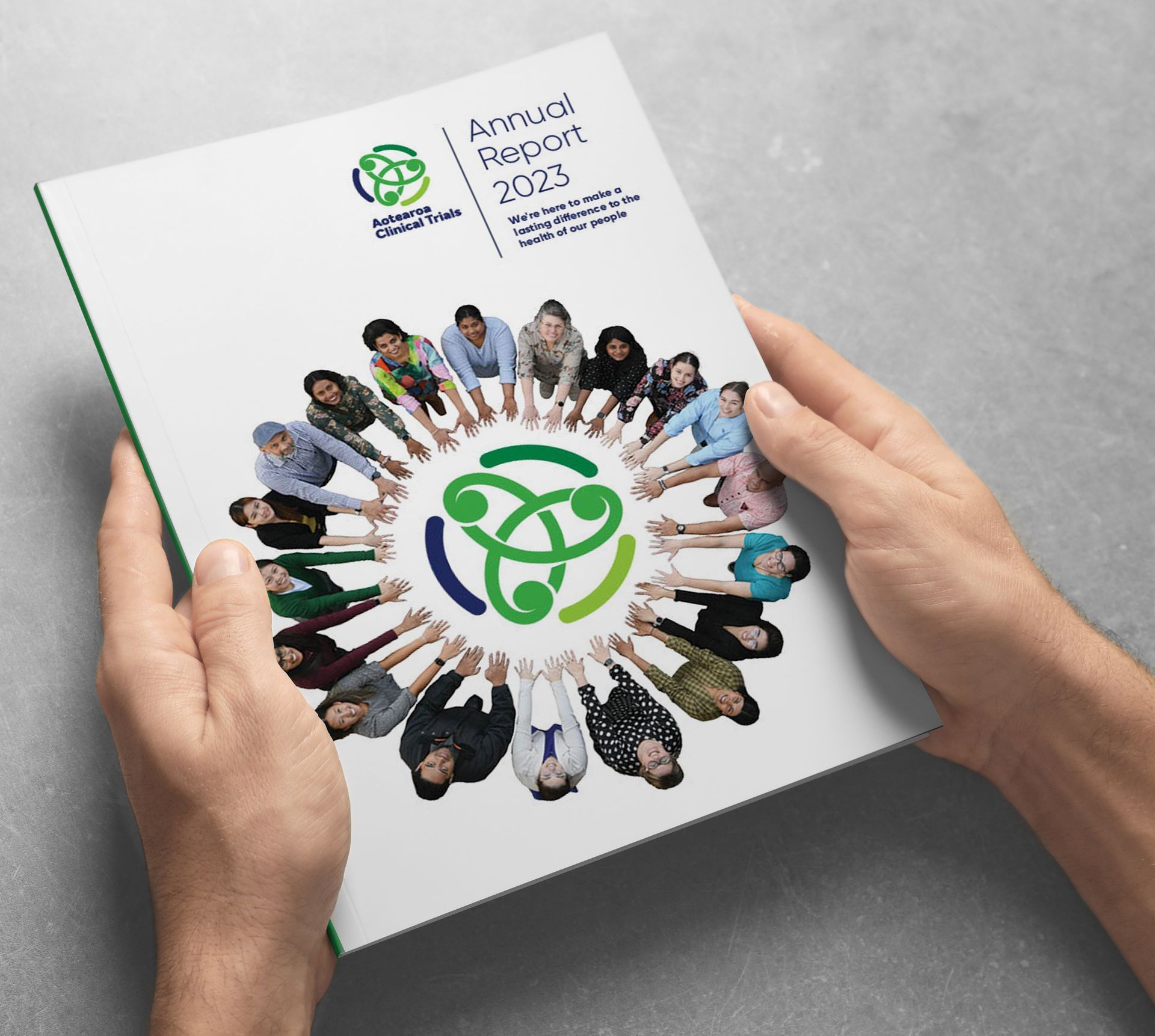
Annual Reports
Digital Publishing, PDF Publishing, and Print
An annual report can be far more than just a dry report of facts. With the right project management it becomes a key marketing tool for any organisation. It can advise stakeholders of change, it reinforces key business strengths, and it becomes a vehicle too advise to a fully engaged audience. Delivery is typically Digital Publishing online, PDF, and hard copy print.

Print Collateral
Printed booklets and support material
In situations such as retail outlets, trade shows and conferences there is still a place for physical handouts. Anywhere that requires the ability to engage with an audience immediately, and then have a leave-behind as a reminder of your business for review later. In these situations print is a critical but overlooked element to a successful conversion.
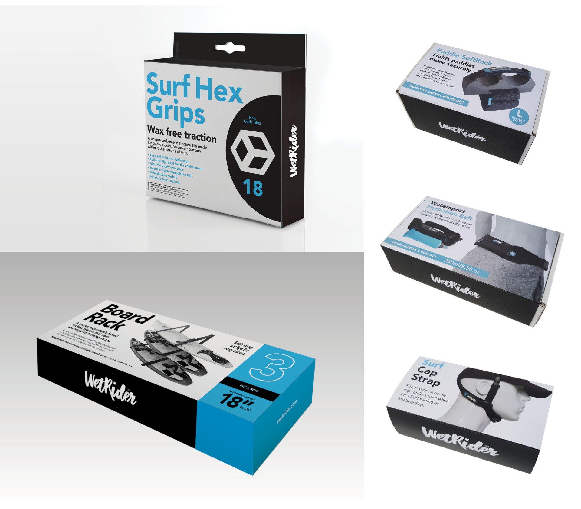
Packaging
Retail packaging
Retail packaging requires a uniform presentation so the consumer can recognise a trusted brand even if the contents, sizes and sometimes context are different. Therefore strong design skills are required to set up the 'product uniform' so the brand appears as distinctive, memorable, and the message remains compelling.
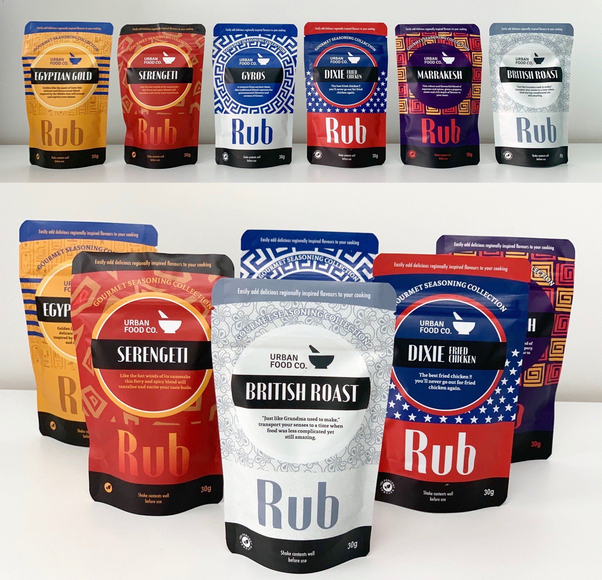
Packaging
Flexible Sachet Food Packaging
This range demonstrates the use of a deliberate design grid to keep elements within a packaging range uniform even when the colours and the graphic imagery are completely different. This results in a range that sits well as a group on a shelf, but which is also instantly identifiable as a group of unique products. In this case the client requested strong colours and symbolism to reflect the geographic nature of the flavoured cooking contents.