
Brand
Branding is central to virtually any business. Once recognition is established via an identity which is the head of a brand you can build reputation, a wider following and ulimately become successful.
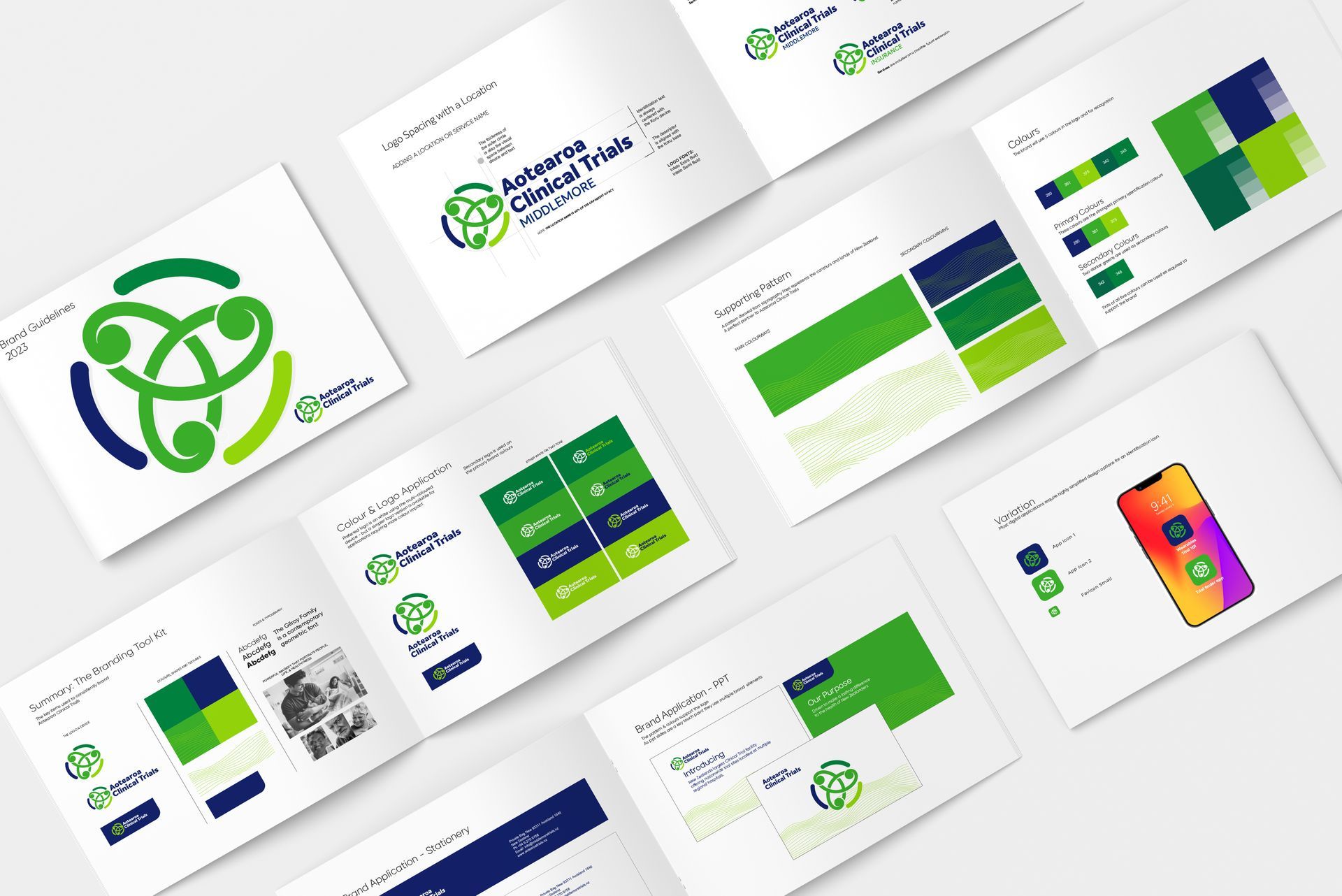
Aotearoa Clinical Trials
National Clinical Trial Providers
in 2023 the regional clinical trial provider of Middlemore Clinical Trials rebranded to become the new national entity of Aotearoa Clinical Trials.
Working with brand strategist Jill Brinsdson from Tricky, Designmanagers successfully rebranded the company and developed a comprehensive toolkit to assist with propelling the company to new international acclaim as New Zealand's leading provider.

BB
Rebranding a traditional organisation
The New Zealand arm of christian youth movement - Boys Brigade (BB) approached us to assist in rebranding their local organisation and to assist in merging two well established operating entities and the head office into one. With a wide volunteer base and strongly entrenched 'defensive positions' this was not an easy task, but the resulting simplified BB logo now provides a new focus, and a strong single visual element to identify with and communicate with their target audience.
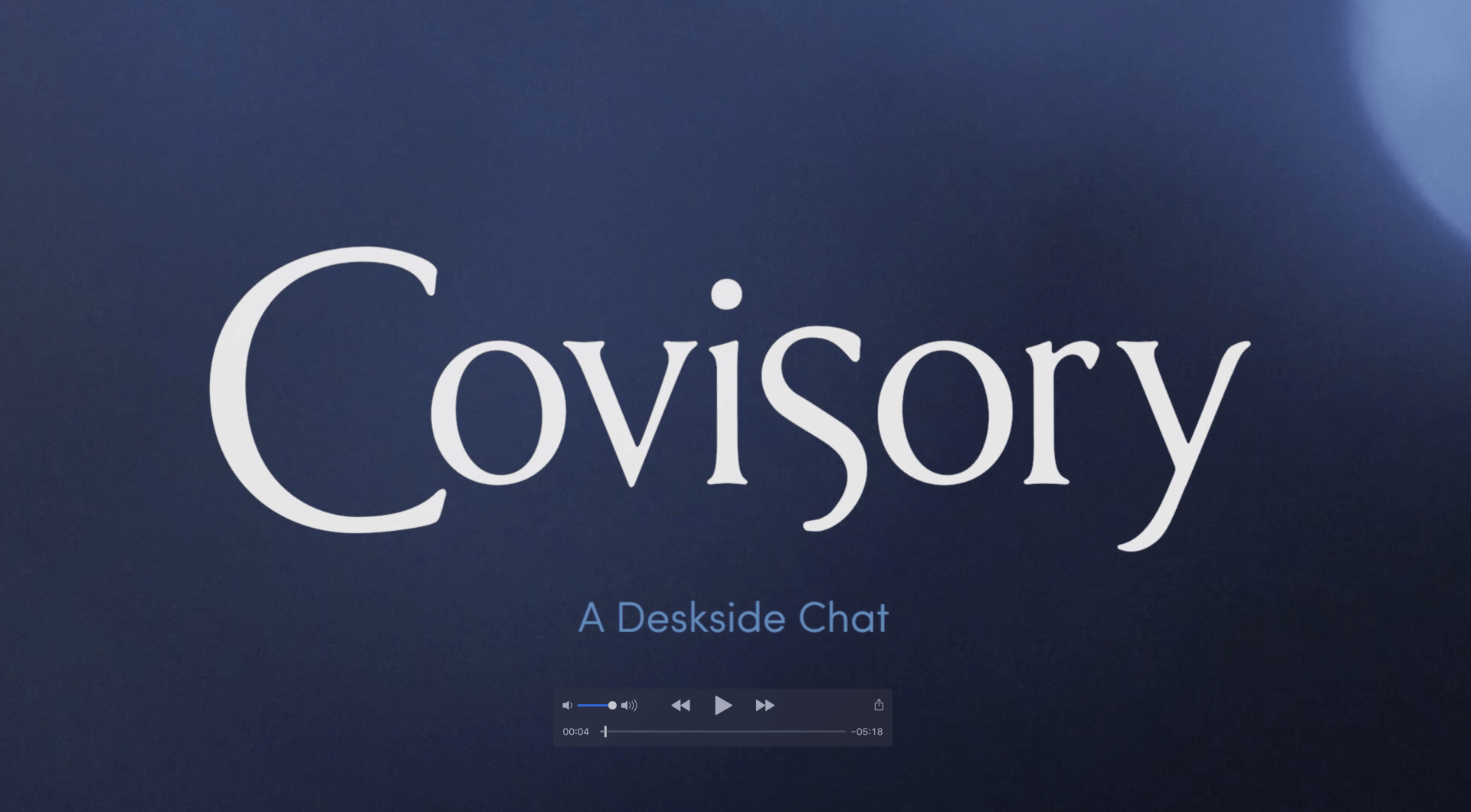
Covisory Group
Business, wealth, and taxation consultants
A well established taxation expert (Nigel Smith) rebranded his niche high end consultancy firm.
As a business dealing with very high-net-worth clientele they required a name and a logo that would sit well and resonate with that exclusive audience.
By merging two key words 'collaborative and advisory' into a new conjoint name of Covisory we strategically set the tone, and helped define their position and promise of working hand in hand with clients and offering the best advice. The final word-mark oozes elegance and quality.
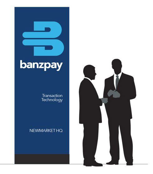
Banzpay
A fintech support company
Co-Op Money New Zealand rebranded to Banzpay in 2021. We were engaged to develop concepts, and all four initial designs were accepted internally and then presented to the board for selection. As part of the discovery and development process we recommended a new repositioning line of 'Transaction Technology' to better reflect their role in providing banking technology to financial services companies, and differentiate them from an operating bank. The 'perpetual B' device was created to represent the 24/7 mission critical backend services they offer.

Infraco Global
An Industrial Parent Company
Completed for local company Naked Marketing this projects aim was to deliver a corporate mark that was highly suitable for head office representation. As the parent company of an industrial they requested a device that sat well with investors, bankers and corporates. The final highly refined and polished word mark fitted that brief perfectly. Note: The apparent simplicity masks the fact that just about every letter is customised in some way to achieve the sophisticated outcome.
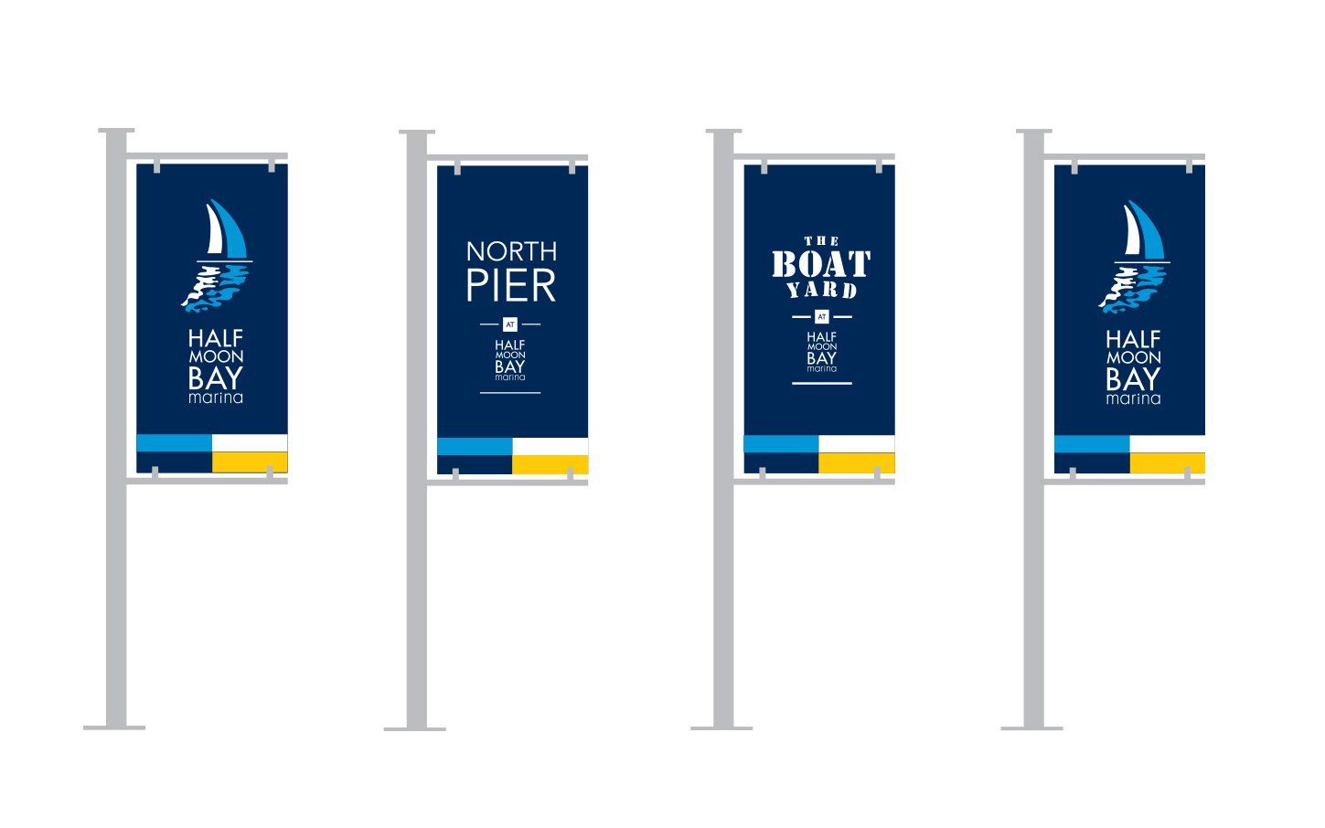
Half Moon Bay Marina
Auckland marina and marine services hub
A long time client Half Moon Bay Marina has seen us create the initial 'half reflecting moon' logo and then over time develop more applications to reflect their growth and evolution into a regional marine hub.
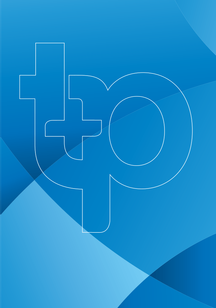
Tyler Price Accountants
Accounting company
When two accounting companies joined forces the surname of the principals was adopted, from there we created a new mark representing T+P.
A strong gradient backround was added for its colourful modern appearance and the shapes in this reflect the curves of the logo device.

Enhanceme
Cosmetic surgery
A well established Dunedin Surgeon decided to move from trading under his own name, to a more contemporary and visionary approach. The name Enhanceme he selected to represent the client dream of what they want, and what they go to a clinic for. Our job was to deliver this in a way that would appeal to a predominantly female audience.
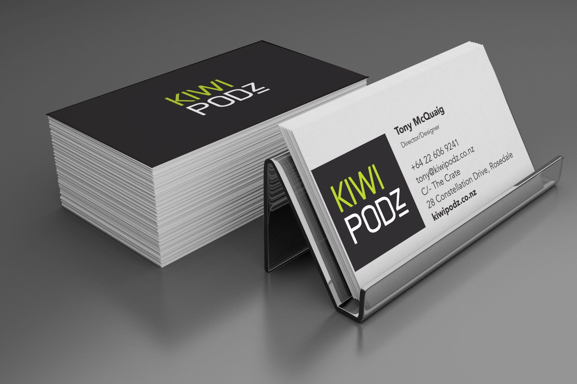
Kiwipodz
Semi-permanent pod structures
A New Zealand designer and engineer developed an innovative accomodation pod that was raised about a metre off the ground on metal legs. The name was developed by us to represent the Kiwi made aspect and focus, We then developed the logo with a raised and floating Z. This Z, as well as creating uniqueness, represented sleeping 'or catching Z'ds' inside the raised structure.
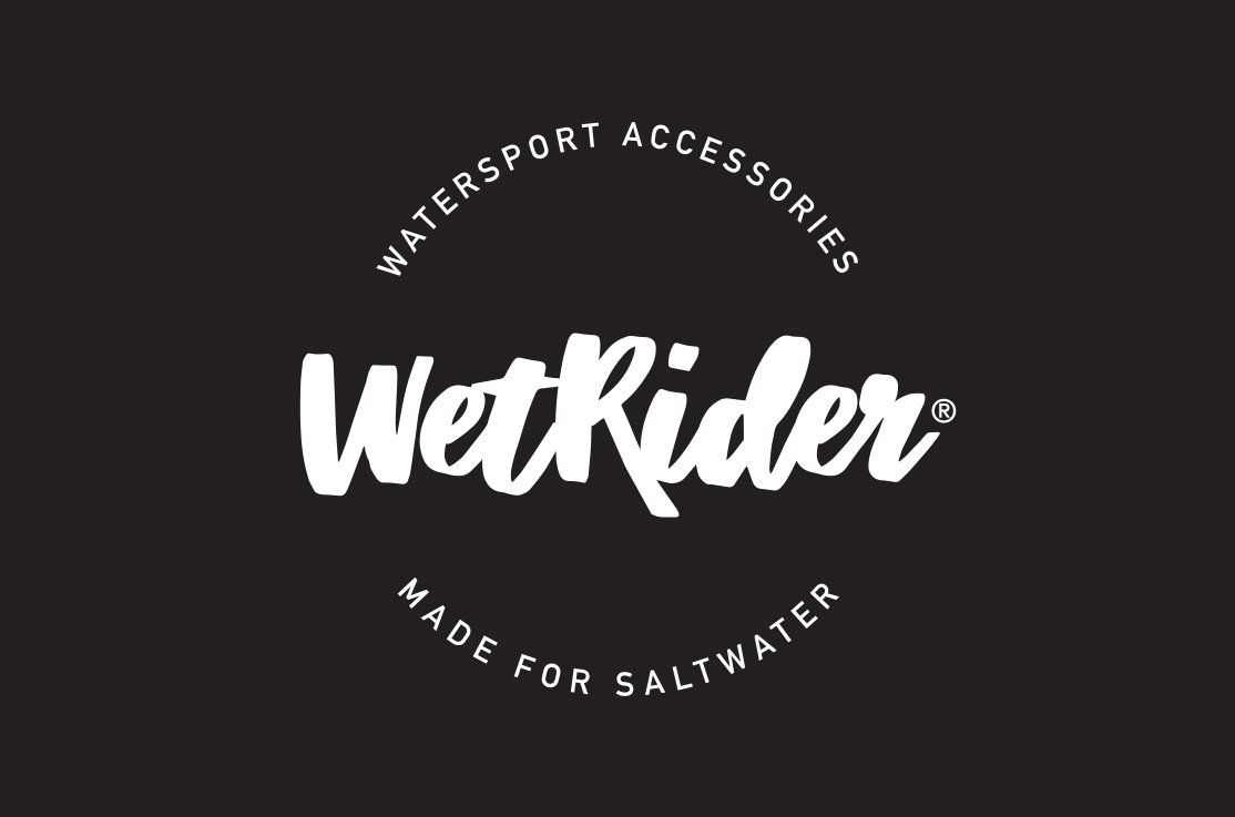
Wetrider
Watersport accessories
Wetrider was a name and logo developed for a small start up offering unique purpose built accessory products for watersports. The target market was surfing, sailing, foiling etc discovery showed a surfy type casual feel would fit this particular clientele. The simple black and white logo treatment allowed a strong visual presence in a wide variety of applications.

Lifemark
Accessibility Consultants & Certifiers
Lifemark came to us with an existing logo, but they requested a strategy on how to grow the brand to fit a wider range of proposed consumer applications. Their desired goal was to grow revenue by monetising accreditations, partnerships, and certifications. Our quest was to develop branded star rating systems and branded partnership logos that could be applied to products and services whilst not in any way eroding the existing word mark. Using a strong secondary colour achieved the required separation.

New Zealand Equipment Group
Civil Works Machinery
New Zealand Equipment Group approached us for a rebrand after they underwent an ownership and name change. They wanted a bold logo and strong brand presence that would sit well beside heavy equipment such as diggers and generators. The resulting NZEG device met that brief as well as looking clean and contemporary, this allowed them to communicate easily with their desired audience.